Can you guess the real size of each country on the new world map?
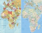
Image: The Guardian
ad slot · in-content video 16:9
Coverage
Wires & papers of record
- Togo-sponsored resolution calls to phase out traditional map that depicts continent as similar size to Greenland The UN general assembly will vote on Friday on a resolution for the world to formally phase out the traditional Mercator map of the globe in favour of one that more accurately displays…
- The Equal Earth projection shows countries’ true size relative to one another, unlike the centuries-old Mercator map, which critics say makes Africa look smaller than it is.
- The Togo-sponsored resolution was backed by 164 nations - the US the only nation to vote against it.
- The U.N. has backed a new map showing Africa in its true relative size, with the U.S. standing alone in opposition.
- As the UN adopts a new world map to reflect Africa's true size, let's take a closer look at what different maps get right and wrong.
Coverage
- The widely-used Mercator map is often criticised for visually exaggerating and centralising Western nations.
- The UN General Assembly voted to adopt a map that more accurately shows the size of the continents. Only the United States voted against the measure, which projects the country as smaller than on traditional maps.
- The UN General Assembly has backed a resolution to change to maps that more accurately show the true size of Africa.
- The new map makes Africa, Latin America, South Asia and Oceania larger than the traditional Mercator projection.
- Pick which country is bigger, then watch it morph from Mercator to Equal Earth projection to see how close you were.